Letter A | Origin, Design & Words With A
The letter A is one of the most important and visually iconic letters in the English alphabet. Its clean, symmetrical shape makes it a popular choice in everything from classroom displays to logos and digital designs. A also has a rich backstory. Its design and pronunciation have evolved over thousands of years, from ancient alphabets to modern typography.
This article explores where letter A came from, how it’s changed, and the many ways it’s used today. When you’re working on design projects with the letter A, QuillBot’s free AI Image Generator can help you experiment with a variety of options.
Letter A logo design from QuillBot’s Logo Generator
![]()
Letter A origin and history
Whether you’re designing a logo, monogram, or custom artwork featuring the letter A, understanding its evolution helps you make intentional stylistic choices. Its long history, from pictorial symbol to foundational vowel, explains why its form feels both stable and versatile in modern design.
- Phoenician letter aleph (1500–1000 BCE): The earliest ancestor of A was the Phoenician letter aleph (𐤀), which represented a glottal stop rather than a vowel. Its shape came from a stylized pictogram of an ox’s head, originally influenced by Egyptian hieroglyphs and often depicted tilted on its side.
- Greek alpha (800 BCE): The Greeks adopted aleph and transformed it into alpha (Α), rotating the form and redefining it as a vowel. This marked a major shift, as the symbol began representing the “ah” sound and took on a more geometric, balanced structure.
- Etruscan and Latin development (700–500 BCE): The Etruscans borrowed alpha and passed it to the Romans, who incorporated it into the Latin alphabet as A. Its clean, angular form became standardized, closely resembling the modern capital letter used today.
- Development of lowercase A (700–1000 CE): The Carolingian minuscule style of handwriting emerged, introducing a more rounded form of A (a) that would eventually become the modern lowercase. Before this period, English writing used only one case. Around 1000 CE, the concept of capitalization began to take hold, and Carolingian minuscule forms were adopted as lowercase letters alongside existing capital forms.
Anatomy of capital A and lowercase A
When you’re creating or choosing a letter A design, it’s helpful to consider how capital A and lowercase A are put together. The typographical terms (in bold) below will help you communicate your design ideas with clarity and precision.
Capital A
Capital A includes three strokes: two diagonal lines and a horizonal crossbar. The point where the two diagonals meet is called the apex. Capital letter A also features two counters: an open counter at the bottom (where the opening is called the aperture), and a closed counter at the top.
Lowercase A
Lowercase A always includes a vertical stem on the right side and a round bowl (with a closed counter) on the left side. Beyond that, you can choose from two different styles:
- Single-storey lowercase A, where the bowl is the same height as the stem (and the x-height of the other lowercase letters in a font)
- Double-storey lowercase A, which has an arc and an open counter above the bowl and an aperture on the left (the open space between the arc and the bowl)

Letter A in different fonts
The look of letter A can change dramatically depending on the font, from playful and rounded to sharp and modern. Consider the variations below when you’re exploring a template or font library, placing a custom order, or prompting AI for a letter A design:
- Serif vs sans serif fonts: In serif fonts (like Georgia), capital A has feet at the base of the strokes and a bracket at the apex, and lowercase A has a ball terminal at the tip of the loop. These details create a traditional, academic aesthetic. Sans serif versions omit these details to emphasize the geometry of lowercase and capital A.
- Stroke contrast and weight: In some serif fonts, like Times New Roman, the left diagonal stroke of capital A is thinner than the right, or the crossbar can be thinner or thicker than the strokes. Fonts with stroke contrast also use tapering for the line that forms the bowl or a finial (a tapered end) for the hook of a double-storey lowercase A. Monoline fonts use a uniform thickness for all of the strokes and lines.
- Crossbar height and the counter: The vertical position of the crossbar in capital A affects the size of the internal triangle (the counter). A high crossbar creates a top-heavy vintage feel, while a lower crossbar in a font like Calibri makes the letter feel more stable and accessible.
- The x-height and proportion: The height of lowercase A relative to the uppercase letters—known as the x-height—changes readability. Fonts with a large x-height, such as Roboto, make lowercase A feel bold and clear even at small sizes, whereas a small x-height creates more white space on the page.
- Bowl proportions in lowercase A: The size and shape of the bowl varies across fonts. A wide, circular bowl a font like Lexend feels friendly and open, while an oval or condensed bowl feels efficient and formal.
- Closed counter shape in capital A: Some fonts display the closed counter as a perfect triangular shape, and in others, the top of the A is flat instead of pointed.
The following chart illustrates some of these differences in 10 of the most common fonts.
| Arial |
Aa |
| Calibri |
Aa |
| Georgia |
Aa |
| Helvetica |
Aa |
| Lexend |
Aa |
| Montserrat |
Aa |
| Open Sans |
Aa |
| Roboto |
Aa |
| Times New Roman |
Aa |
| Verdana |
Aa |
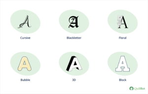
Letter A design ideas
In addition to the many font variations, there are endless ways to display or design the letter A, including these popular styles:
- Cursive letter L for elegant art projects, monogrammed gifts, and stationery
- Blackletter A (aka Old English A) for formal certificates or a historical vibe
- Floral letter A for art prints or garden-themed decorations and crafts
- Bubble letter A for playful posters, classroom displays, and party decorations
- 3D A for logos, presentation title slides, and tech-focused designs
- Block letter A for posters, signage, or retro designs
Letter A design ideas
Words that start with A
When you’re designing something for a name or product that starts with the letter A, using other words that start with A adds repetition that can make your design more memorable. There are over 20,000 words to choose from, and the lists below include some of the most common ones.
- 3-letter words: Act, add, age, ago, aid, aim, air, ant, ape, are, ark, ant, any, arm, art, ash, ask, ate, axe
- 4-letter words: Able, ache, acid, afar, ally, aloe, also, amen, army, aunt, avid, away
- 5-letter words: About, above, acorn, actor, adage, adapt, admit, adopt, adult, after, again, agree, ahead, aisle, alarm, alert, alien, align, alike, alone, along, aloud, amaze, among, amuse, angel, apart, apple, aroma, arrow, aside, aster, attic, avoid, award, aware
- 6-letter words: Aboard, absent, accept, across, action, adjust, admire, advice, affect, afford, agency, animal, anthem, anyway, appeal, appear, around, asleep, assume, assure, attach, attend, attire, author, autumn, avenue, awaken
You can find even more examples in adjectives that start with A, animals that start with A, and flowers that start with A.
Words that end in A
English words that end in A can also be useful when you want to create visual symmetry or repetition with the letterform. Options include:
- 3-letter words: Era, sea, spa, pea, tea
- 4-letter words: Aura, data, diva, idea, lava, saga, soda, sofa, tuna, visa, yoga
- 5-letter words: Arena, aroma, cocoa, comma, dogma, drama, koala, larva, mania, media, ninja, opera, pasta, pizza, zebra
- 6-letter words: Agenda, asthma, banana, fedora, phobia, retina, saliva, schema, trivia, utopia
Other letters of the alphabet
For details about other letters of the alphabet, check out these articles.
| Letter B | Letter G | Letter L | Letter Q | Letter V |
| Letter C | Letter H | Letter M | Letter R | Letter W |
| Letter D | Letter I | Letter N | Letter S | Letter X |
| Letter E | Letter J | Letter O | Letter T | Letter Y |
| Letter F | Letter K | Letter P | Letter U | Letter Z |
Frequently asked questions about the letter A
- What letter is never at the end of a word?
-
The letters J, Q, and V are almost never at the end of a word in English. The English words that end in J, Q, and V are mostly loanwords that come from another language. For example, a kalij is a type of pheasant in India.
QuillBot’s AI Chat can show you lists of words that end in certain letters (e.g., letter A), and it’s completely free to use.
- How do you spell A?
-
The letter A is spelled “a,” and it’s pronounced “ay” like in “pay.” This is also the spelling for the indefinite article that goes before a noun or modifier that begins with a consonant (e.g., “I ordered a pink sweater”).
When you’re curious about how to spell other letters of the English alphabet, QuillBot’s free AI Chat can answer your questions in seconds.
- What are some double A letter words?
-
Double A letter words in English include:
- Aardvark: Type of large mammal with a long snout
- Afrikaans: One of the languages spoken in South Africa
- Bazaar: Outdoor market with rows of booths and stalls
- Isaac: Biblical name
- Naan: Round, flat bread common in Indian cuisine
English words that include double A are often loanwords that come from other languages.
When you’re curious about word trivia or letter combinations, ask QuillBot’s free AI Chat for fun and interesting facts.
- What is a serif font?
-
A serif font is a typeface that has small decorative lines (called “feet”) at the end of each stroke in a letter. The most common serif font is Times New Roman.
Serif fonts are common in print media (e.g., books and magazines), where they’re more reader-friendly. For example, lowercase letter A is much more distinct from lowercase letter O in a serif font.
When you’re working on creative projects and want to experiment with lettering, QuillBot’s free AI image generator can show you how letters of the alphabet look in serif or sans serif fonts.
- What is a sans-serif font?
-
A sans serif font is a typeface that does not have serifs (decorative lines called “feet” at the end of each letter’s strokes). “Sans” means “without.”
Sans-serif fonts are common in reading materials for early learners, web-based reading materials, and signage. Arial and Verdana are two common sans-serif fonts.
When you’re designing something with letters and want to experiment with different typefaces, try QuillBot’s free AI image generator. For example, you can prompt it to make an image of a letter A without serifs and with any type of background.
Cite this QuillBot article
We encourage the use of reliable sources in all types of writing. You can copy and paste the citation or click the "Cite this article" button to automatically add it to our free Citation Generator.
Routh, N. (2026, March 18). Letter A | Origin, Design & Words With A. Quillbot. Retrieved March 20, 2026, from /blog/letters/letter-a/
